Cloud Observability Platform
NOTE: The content in this project has been scrubbed or altered due to Client NDA.
OVERVIEW
Project: B2B Enterprise, SaaS
Duration: 6 Month Engagement
Process: Agile Dev and Design Sprints
App/Tools: Figma, Github, Storyboard
CONSULTANT
Design and Research Lead
Defined project plan and scope
Planned and conducted user interviews
Collaborated with Project Sponsor and Stakeholders to define product requirement
Designed conceptual wireframes + prototype
Led design reviews with SMEs/ tech leads
Conducted user validation sessions with engineers and customer support
DELIVERABLES
User Research Key Findings
Personas
Wireframes + Interactive Prototype
Design Annotations
Digital Assets
OBJECTIVE
Design a single platform which ingests data from 3 major cloud providers and existing cloud monitoring tools to support the ability to observe cloud activitiy, manage deployed assets, address performance issues, and proactively reduce outages
CURRENT CHALLENGES
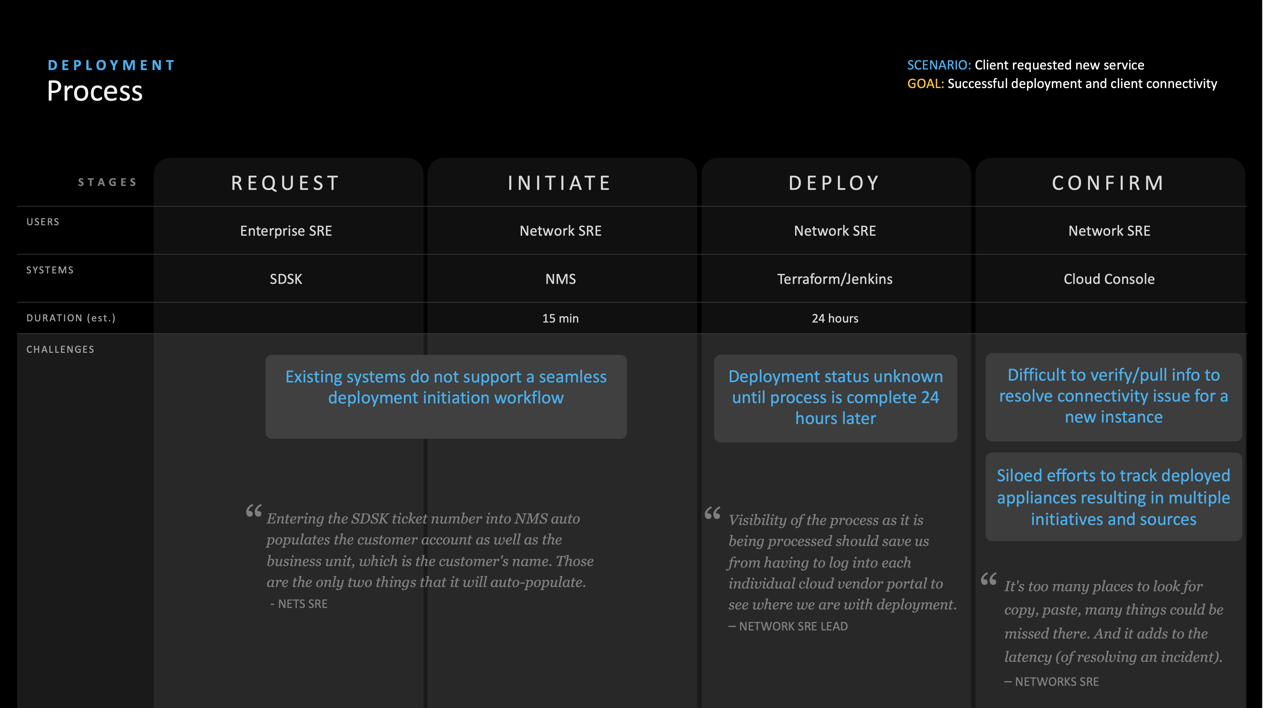
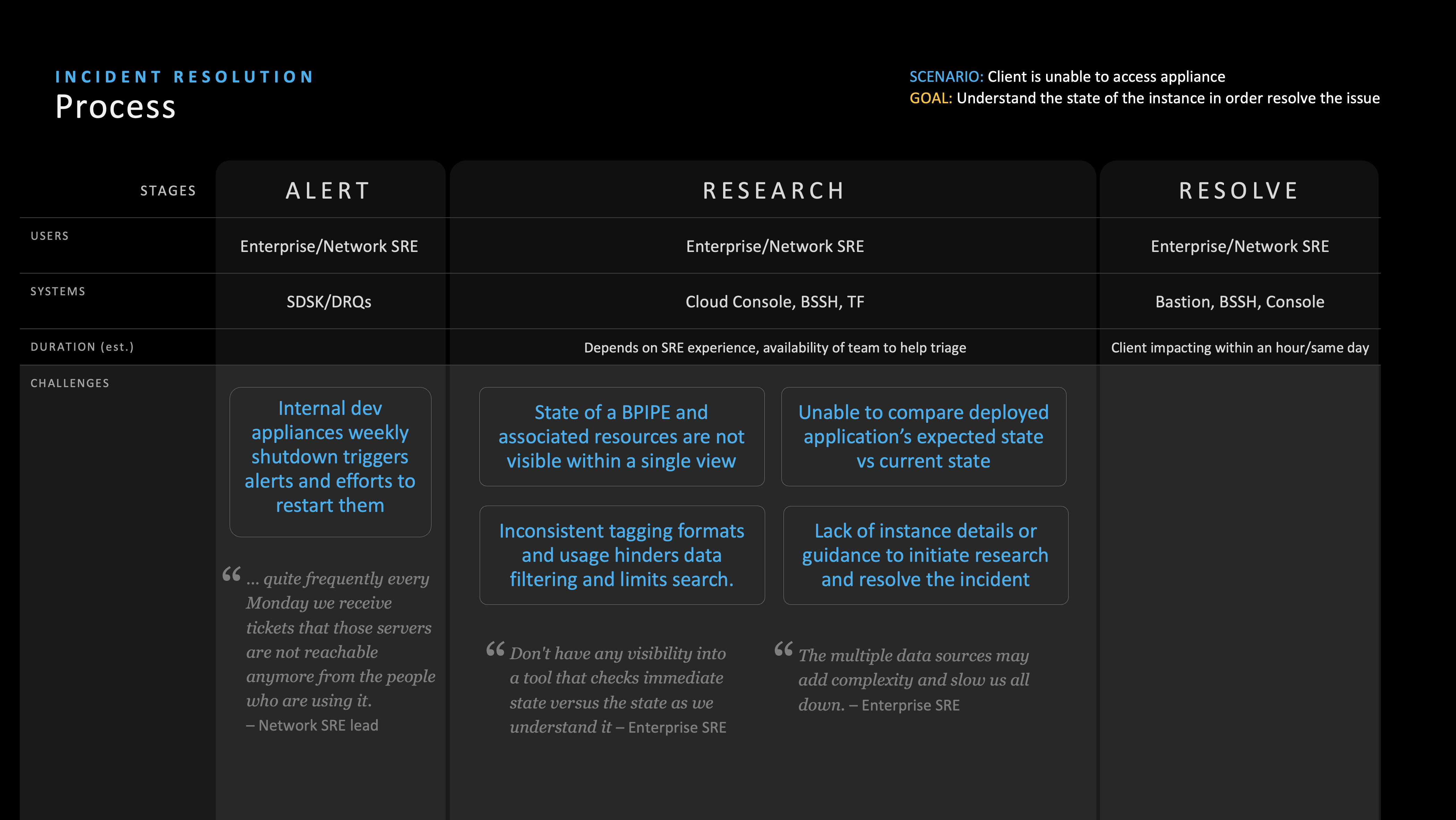
Engineers and Customer Support have to constantly login and out of each cloud provider's monitoring tools throughout their day to address deployment or performance issues.
Each cloud provider had their own unique UI and data labels resulting in heavy mental load, high learning curve for users and inefficiencies in workflow.
Inability to observe and monitor cloud performance and assets in a single platform order to proactively reduce outages and incidents
THE APPROACH

DISCOVER
Conducted user research to understand Engineers and Customer Support current workflow and experience as well as challenges
Defined personas, journeys and key findings deck to guide project vision and strategy discussions based on user research
ALIGN
Reviewed outcomes of the user research with key stakeholders to identify and priortize requirements for the MVP of the inital design of the platform
Refined project plan to ensure design activities aligned with development sprint cycle and communicate deployment schedule with upper managment
DESIGN
Iterative on the design through collobrative design reviews with project owner and engineers to ensure technical feasibility and alignment of project scope
Conducted user feedback sessions to identify potential issues with designs and address them prior to handoff to developers
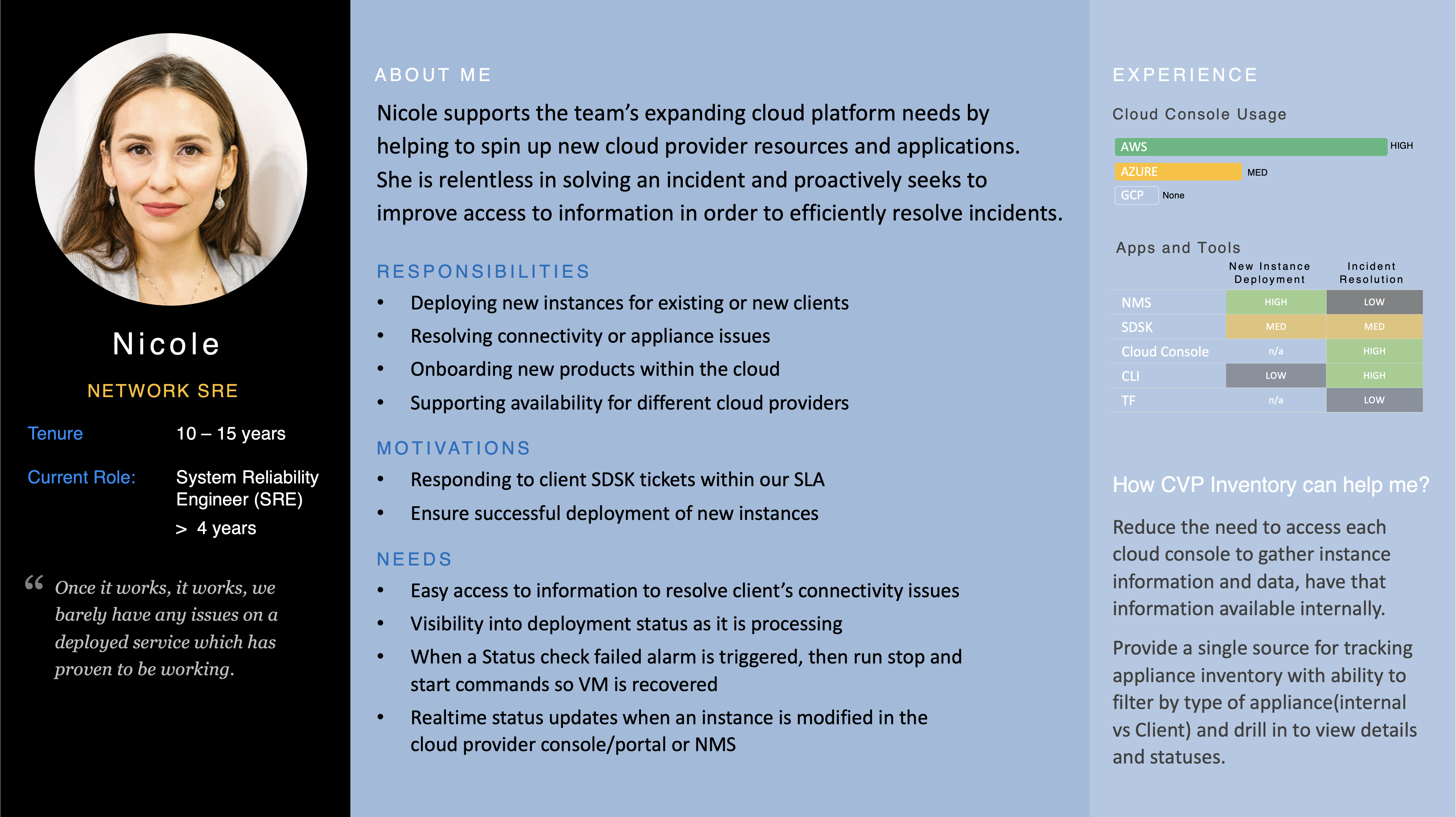
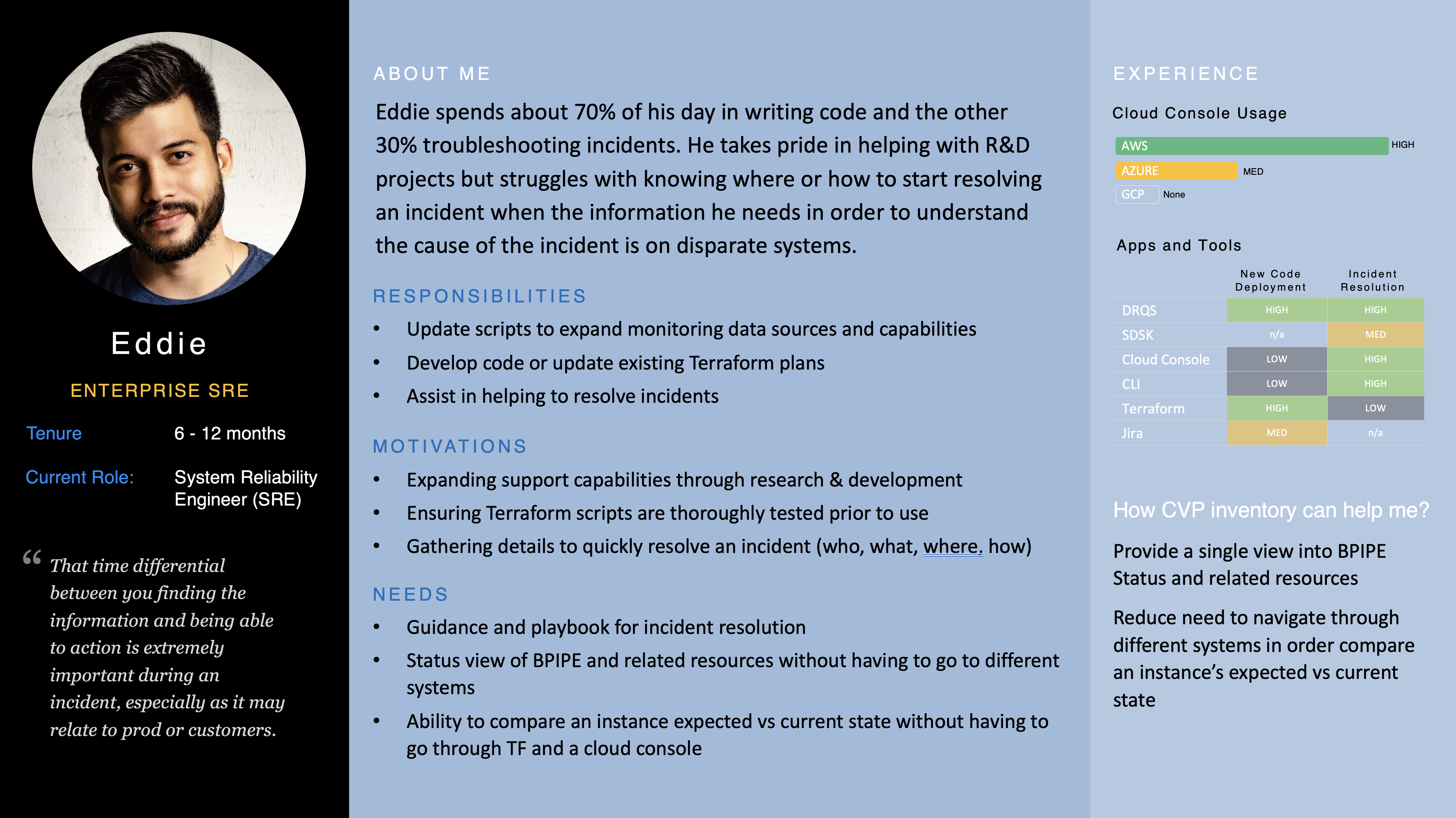
PERSONAS + JOURNEYS
DESIGN
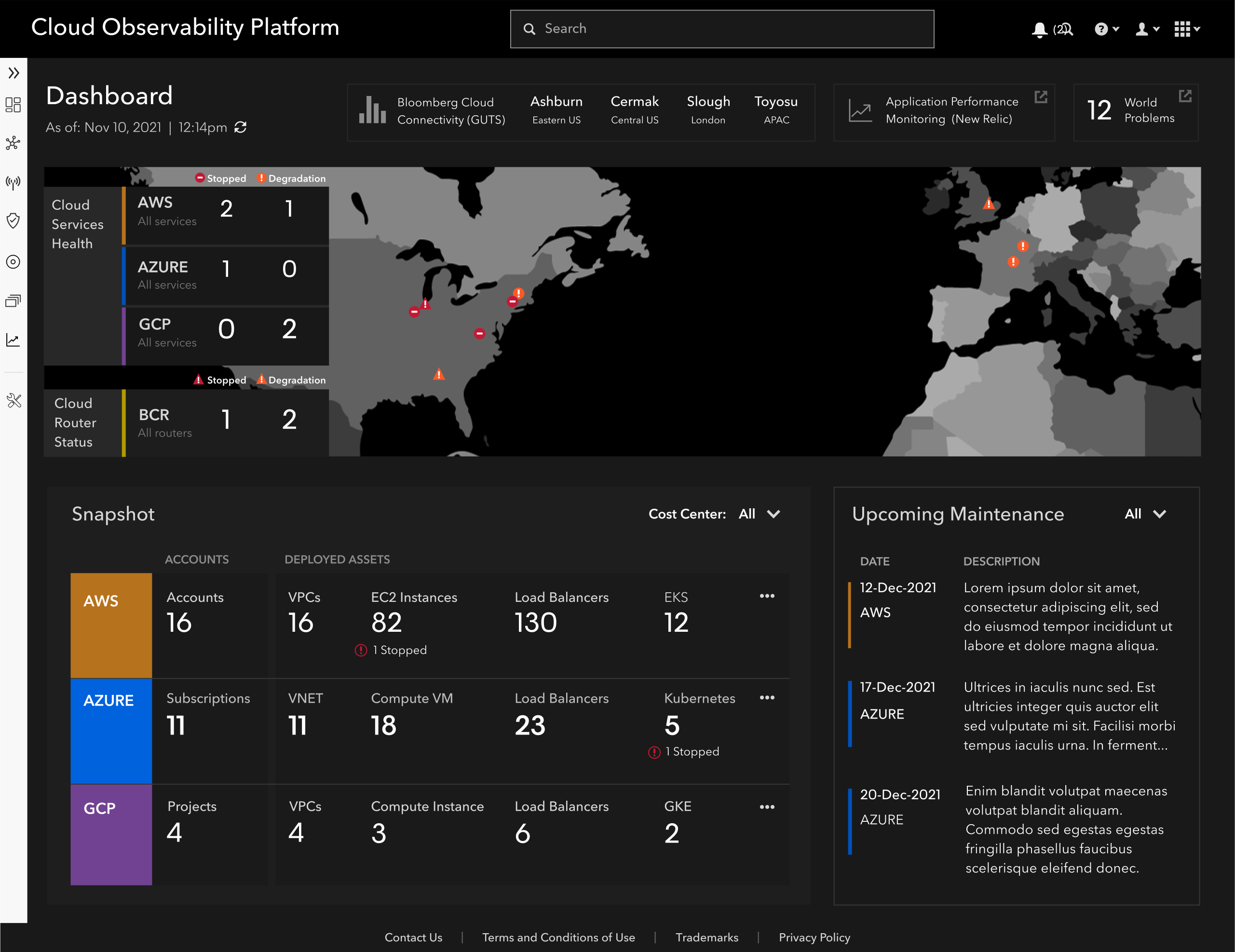
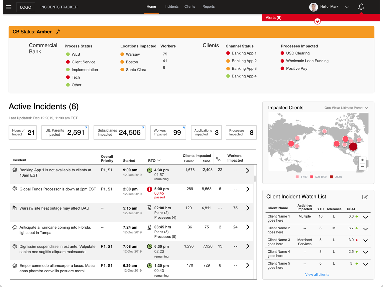
HOMEPAGE
Providing the right signals for where or what may be causing potential problems was a key tenet throughout the project. As soon as the user lands on the homepage of the platform, they have all the data, visual signals, and tools needed to start troubleshooting an issue or explore the state of the cloud services which have been deployed.
Main Left Nav
Flyout menu provides the ability to access categorized deployed assets and supporting tools for the management and deployment of cloud services and products
Categories were defined based on card sorting activity
with end users to identify grouping and labels which best reflected their terminology and mental model.
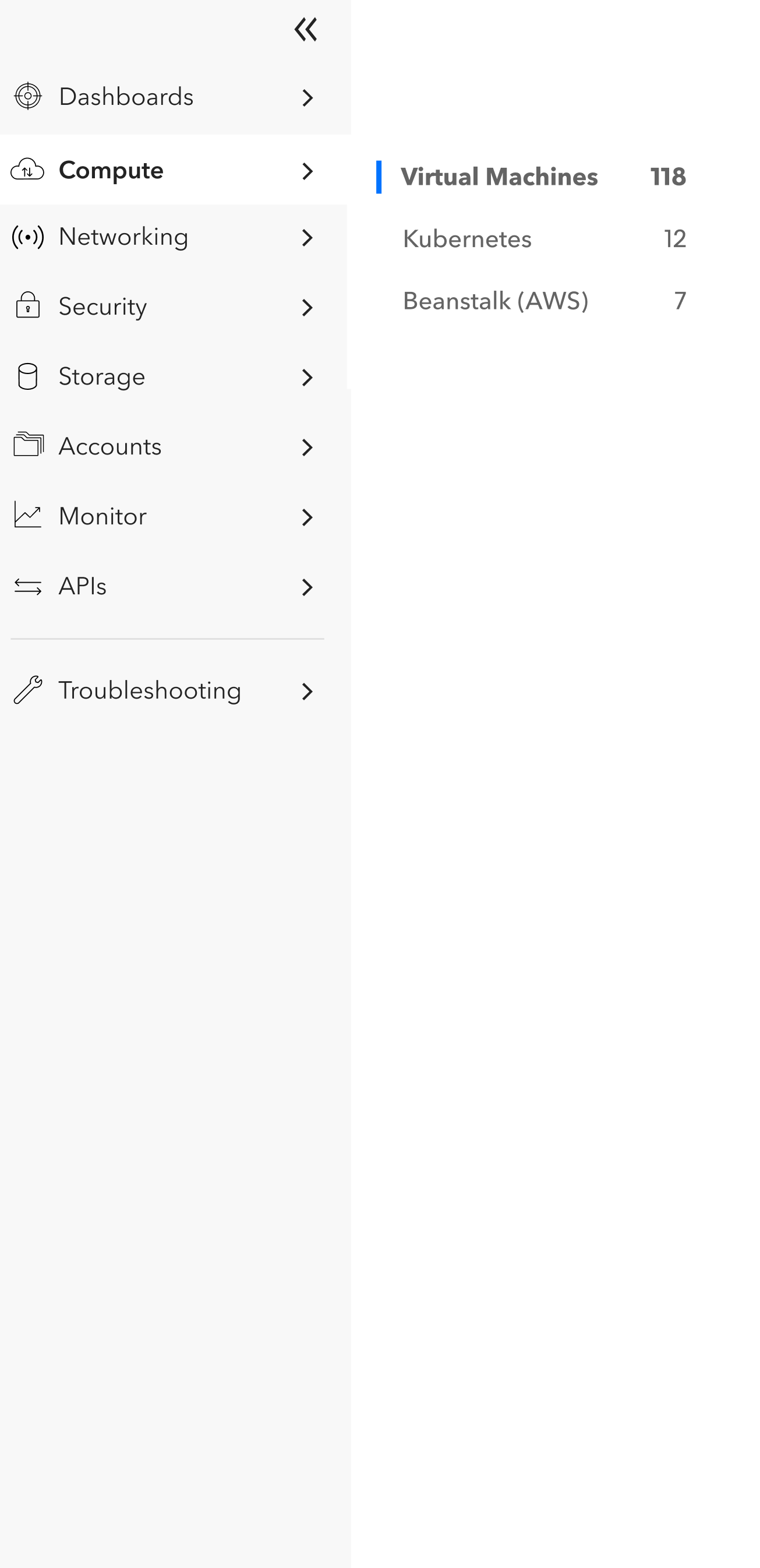
List Page
Provides users with the ability to view a specfic asset type across all 3 cloud providers in a single platform. This reduced the need to log into each cloud provider to understand an asset's issues and increased speed to customer service ticket resolution.
The design of the List page provided the flexibiity needed to became the standard template for the display of all assets within the platform.
Virtual Machines list page
Single view across all cloud providers displays summary of deployment virtual machines globally and allows users to immediately identify which instance of the virtual machine needs immediate attention.
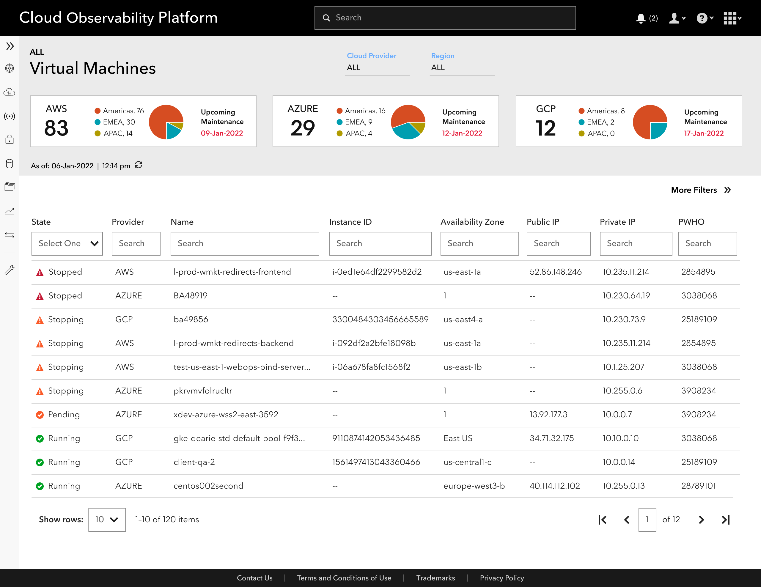
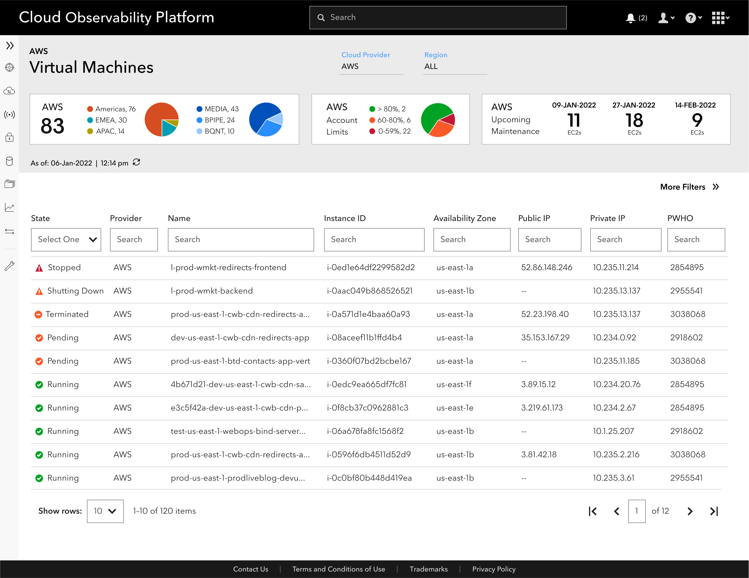
List filtered by Provider
Selecting a cloud provider in the page filter refreshes all the content on the page including the list below the Summary Tiles. Summary tiles displayed important information engineers needed to track deployments on a regional and departmental level as well as their cloud account capacitiy limitations in order manage it and proactively request an increase as needed.
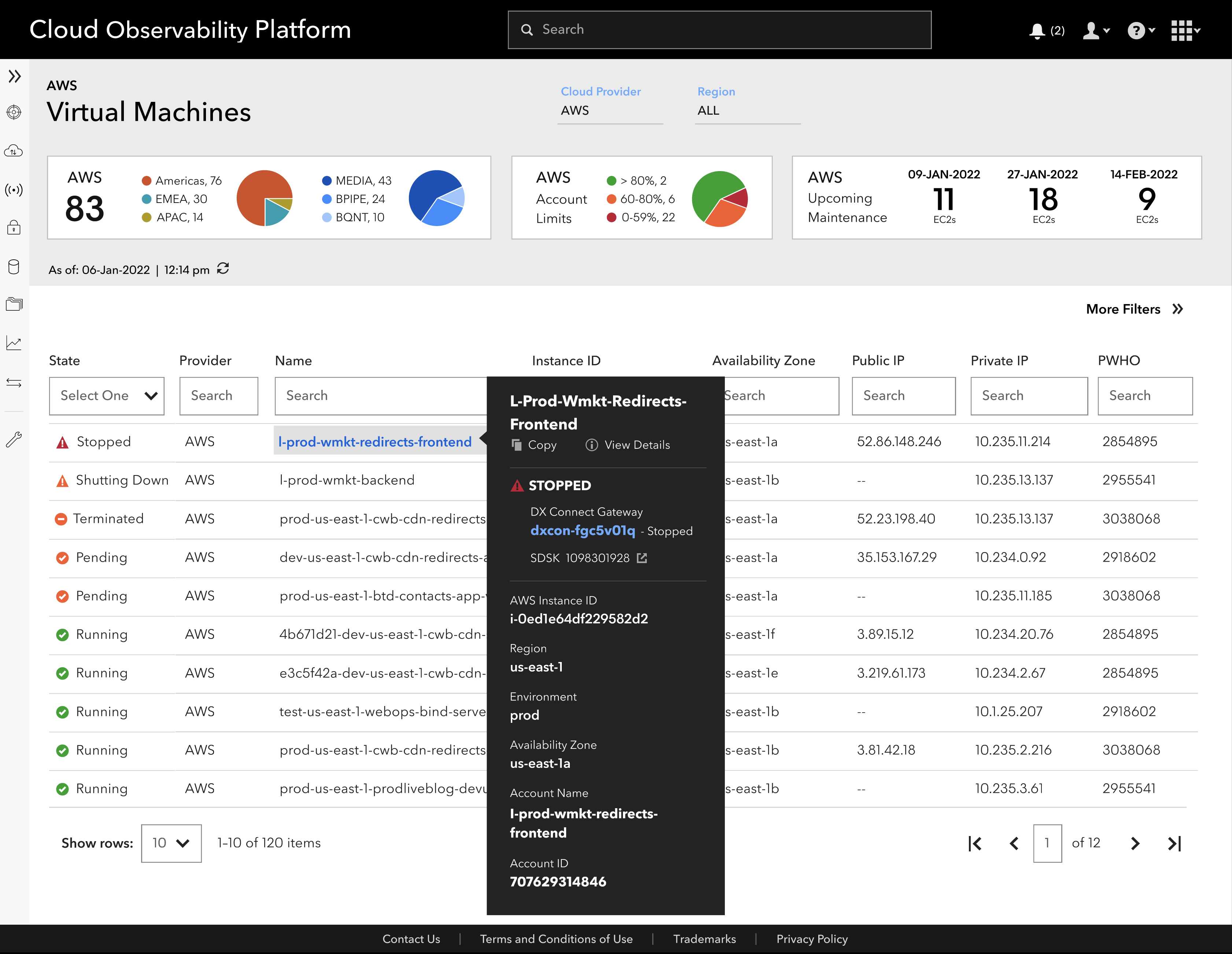
Flyout content provided engineers and customer service staff with quick access to the most common troubleshooting information needed to analyze an issue without having to drill down into the details.
Details Page
The details page design focused on providing uses with access to the most important instance details at the top of the page by remaining fixed as users scroll within each tab below. Labels and categorization of the asset details were derived from card sorting exercise conducted with engineers and customer service to ensure labels were easy to understand and also extensible across the AWS, GCP, and Azure assets.
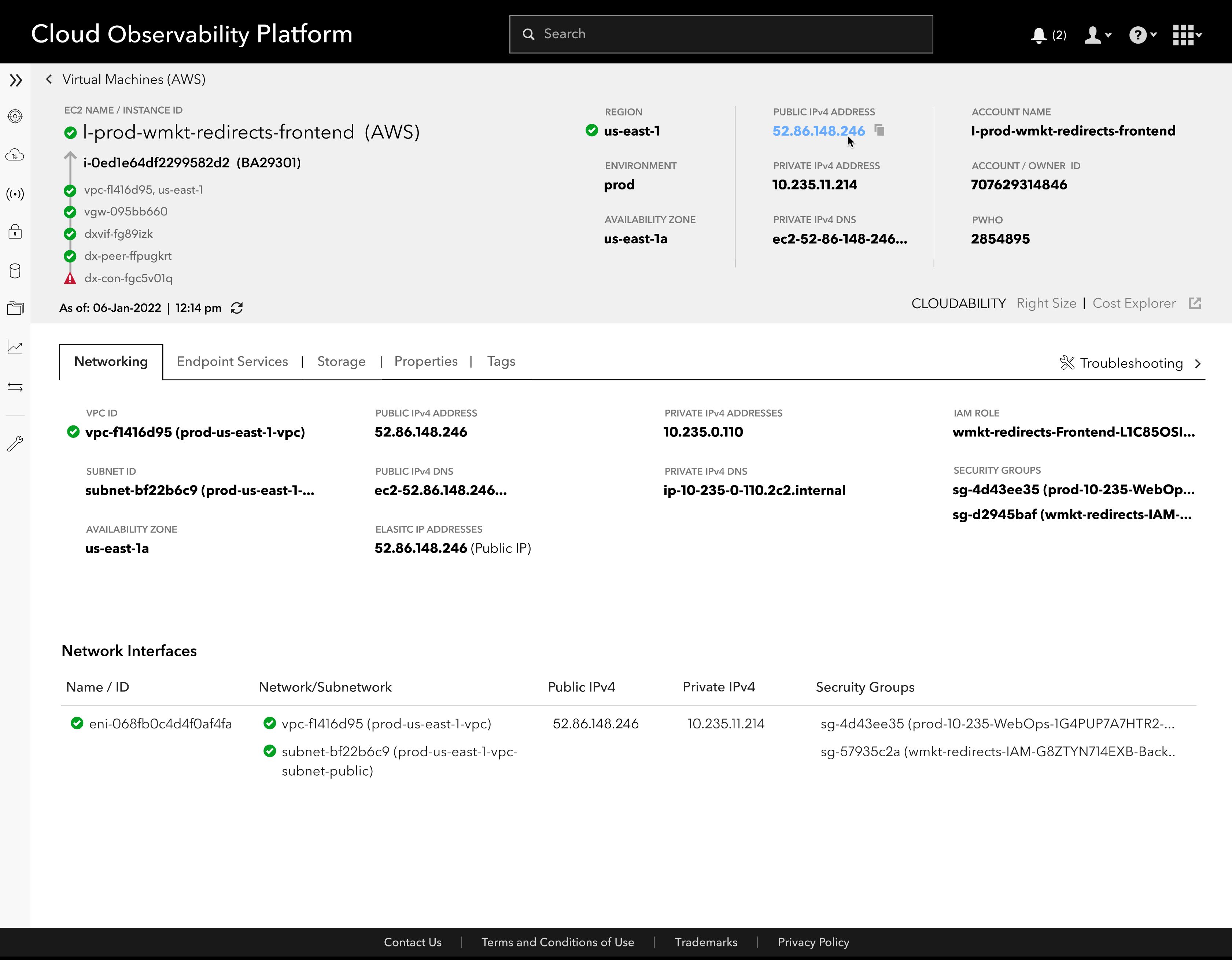
Users are able to quickly scan and see clear signals of where they needed to drill down more in order to take immediate action when troubleshooting a customer support ticket.
Hovering over any asset information provided the user with the option to copy that information into other tools that may be used for troubleshooting or analysis.
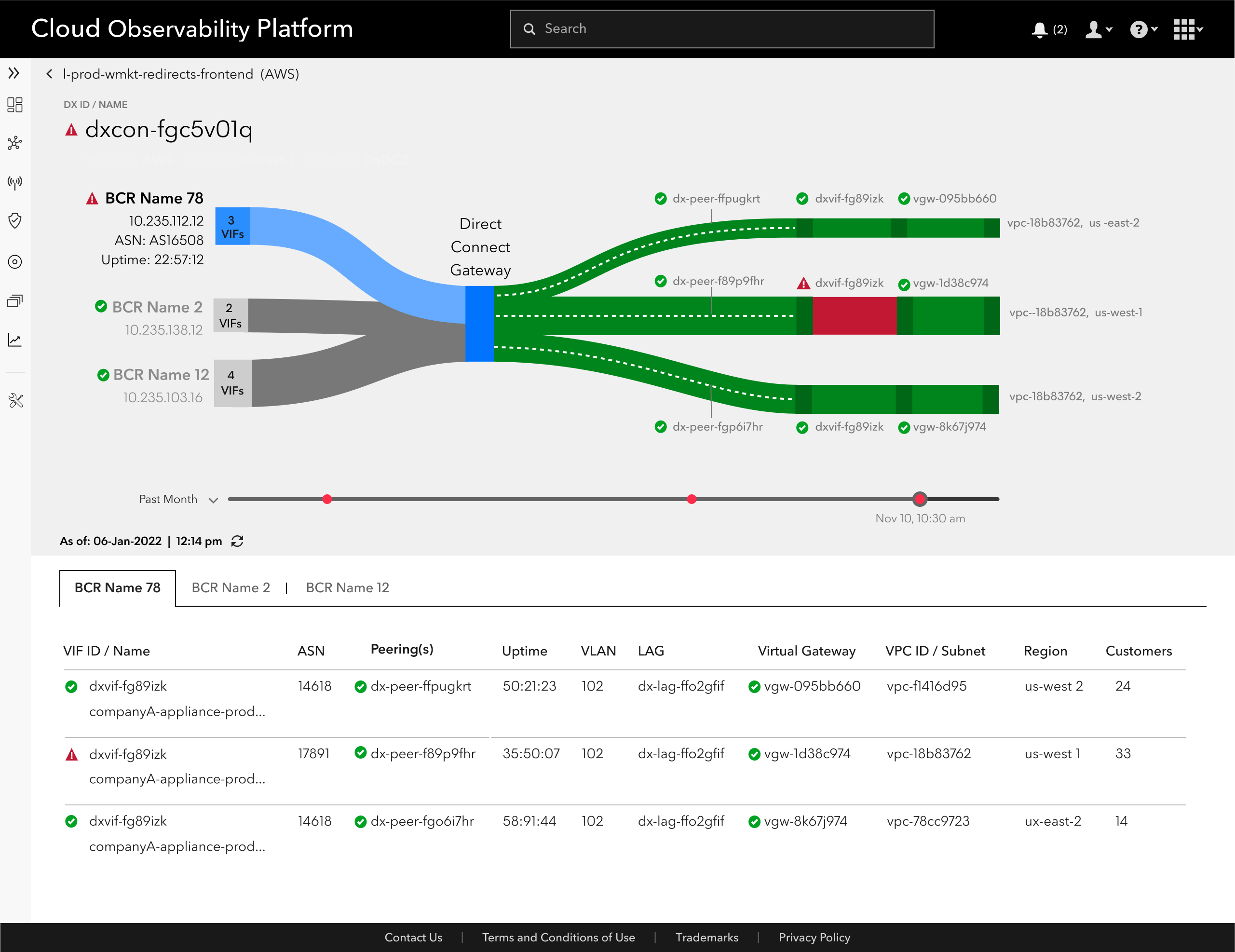
Network details page
The ability to view where in the data flow connectivity issues were occuring was a high priority for engineers and custome services.
The visual display of the data flow as well as links to view more details of each connection point greatly improved assessment of connectivy issues in a timely manner.
OUTCOMES
Alignment on product vision and scope through consistent weekly stakeholder checkins allowed us to complete the design of Cloud Observability MVP within 5 instead of 6 mos
Developed reusable and extensible templates for List Pages and Details pages which accomodates the different content and terminology used across the three cloud providers (AWS, AZURE, GCP)
Involving the technical product owner and engineers early in the discover phase and throughout the project allowed them to understand and value the UX design process, confidently defend the decisions we made to upper management and create excitement about the platform across the Enterprise Cloud team
Existing design system provided the framework to quickly establish consistent basic interactions and screenflows. It allowed us to explore new and innovative ways to create am elegant and simple experience on the platform - some of which extended the design system by introducting new reusable components.
Reduced the need to login and use multiple apps (from 7 to 3 apps/tools) and support future decommisioning of tools no longer needed.
Designing ahead by 2 sprints allowed for continuous adjustment of designs during development between
designers and engineers
Selected Works
Auto ManufacturerCX Touchpoint Journey Map + Strategy
Auto InsuranceJourney Mapping + Strategy
eCommerce Website RedesignResearch + Design, eCommerce
Incident Response ApplicationResearch + Design, B2B Enterprise
Online Personal Loan AppDesign, Online Loan Application
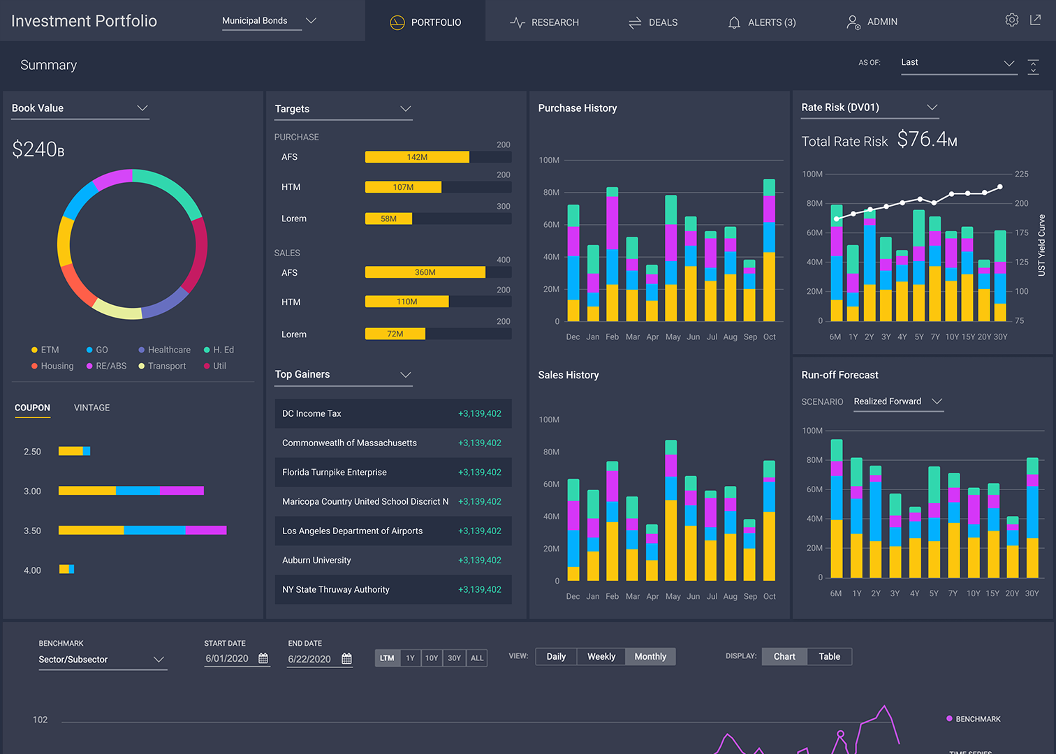
Investment Portfolio WorkstationResearch + Design, B2B Enterprise

Online Learning PlatformResearch and Strategy